Mobile connect is an authenticator login process that logs you into various different 3rd party websites by using the stored data from the users mobile network provider. Once the user has granted permission for Mobile connect to use this data, users of Mobile connect will be able to login to sites without signing up.
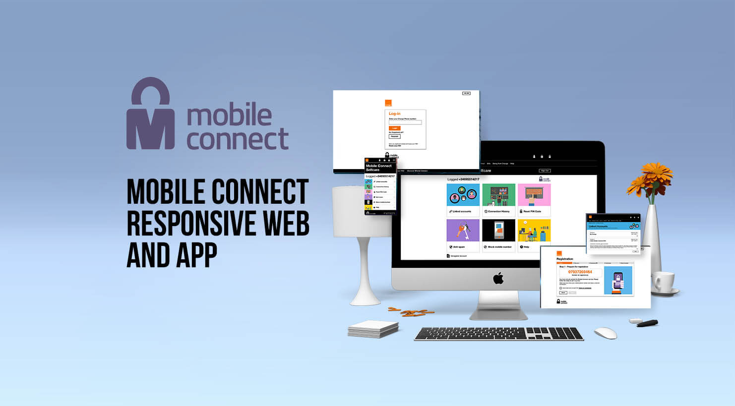
The aim of the project was to redesign the user experience of this service in order to make it clearer for the users what Mobile connect is and how it meant to be used. This was a responsive web design and an Android app project.
The research for this project involved looking at the older site in order to determine why users were struggling to find out what Mobile connect is and how I could improve this in my design. I discovered that most of the previous design did not match the orange style guidelines so this was a vital element that needed to be incorporated in my redesign. The most important change that needed to be made was that there was not a straightforward way for users to enter their details in the self-care section (this is where account changes are made). Thus by including a visible self-care section in my redesign this would dramatically increase its usage.
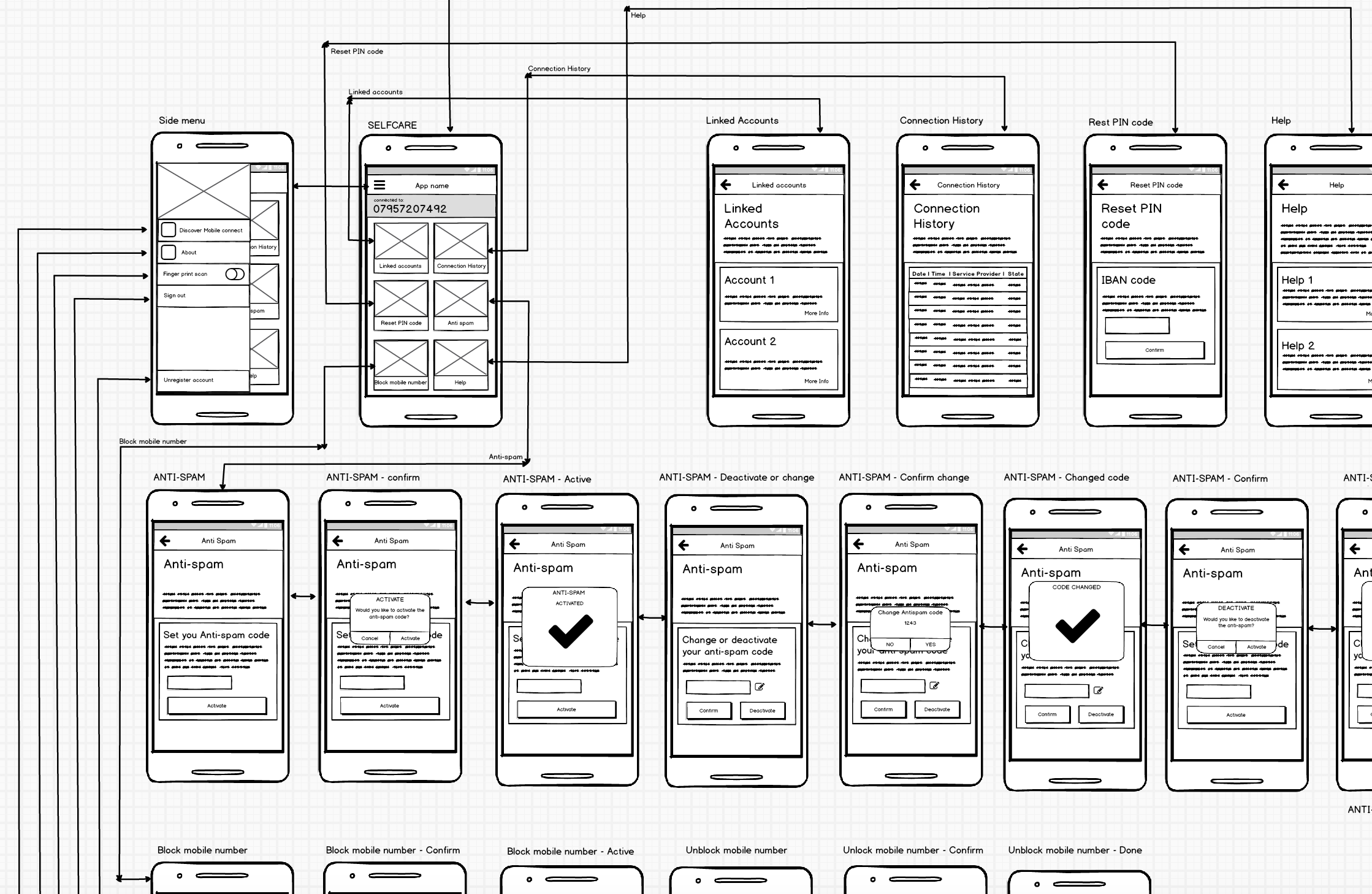
I used Balsmiq Mock-ups to create the wireframes, these were quite complex as I had to consider how a desktop would communicate with the app and mobile web journey.
When I created these designs I kept in mind that the most important elements of the designs were the visual clarity of the service provided and easy navigation. I ensured that these elements were incorporated in the login screen so that it was clear to the user what was required of them. For this project I created the login process, registration and the mobile connect self-care section and I created this for Desktop, mobile and Android platforms. This was created using sketch and involved me incorporating the orange brand guidelines. When creating these designs I had to bear in mind that this is a cross platform application so the experience would differ on each device.
I created three different prototypes using Invision for mobile and desktop platforms. I created these using the craft plugin and creating gifs for the animated parts of the design. I have created 3 different prototypes for Desktop, mobile and Android App.
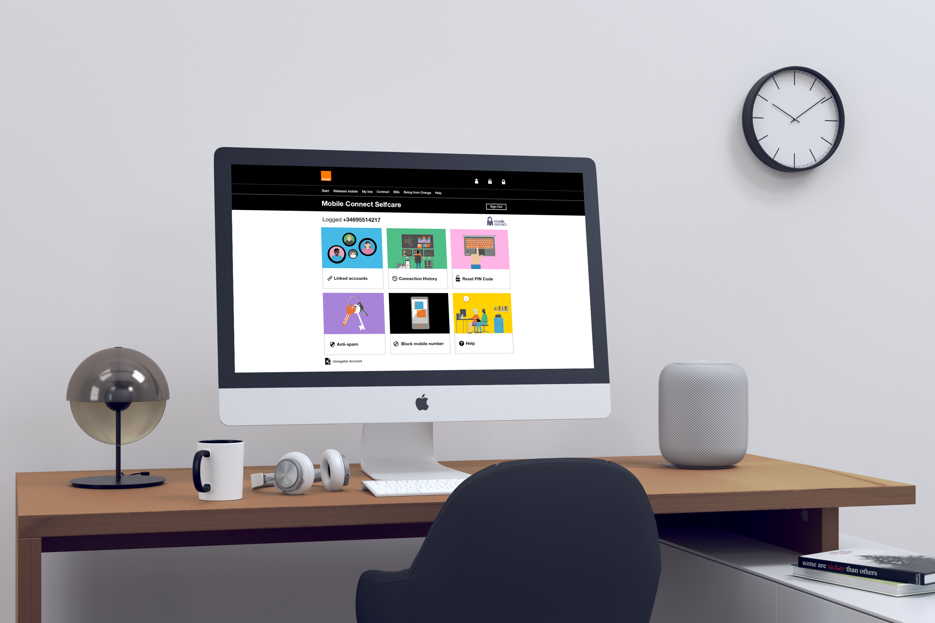
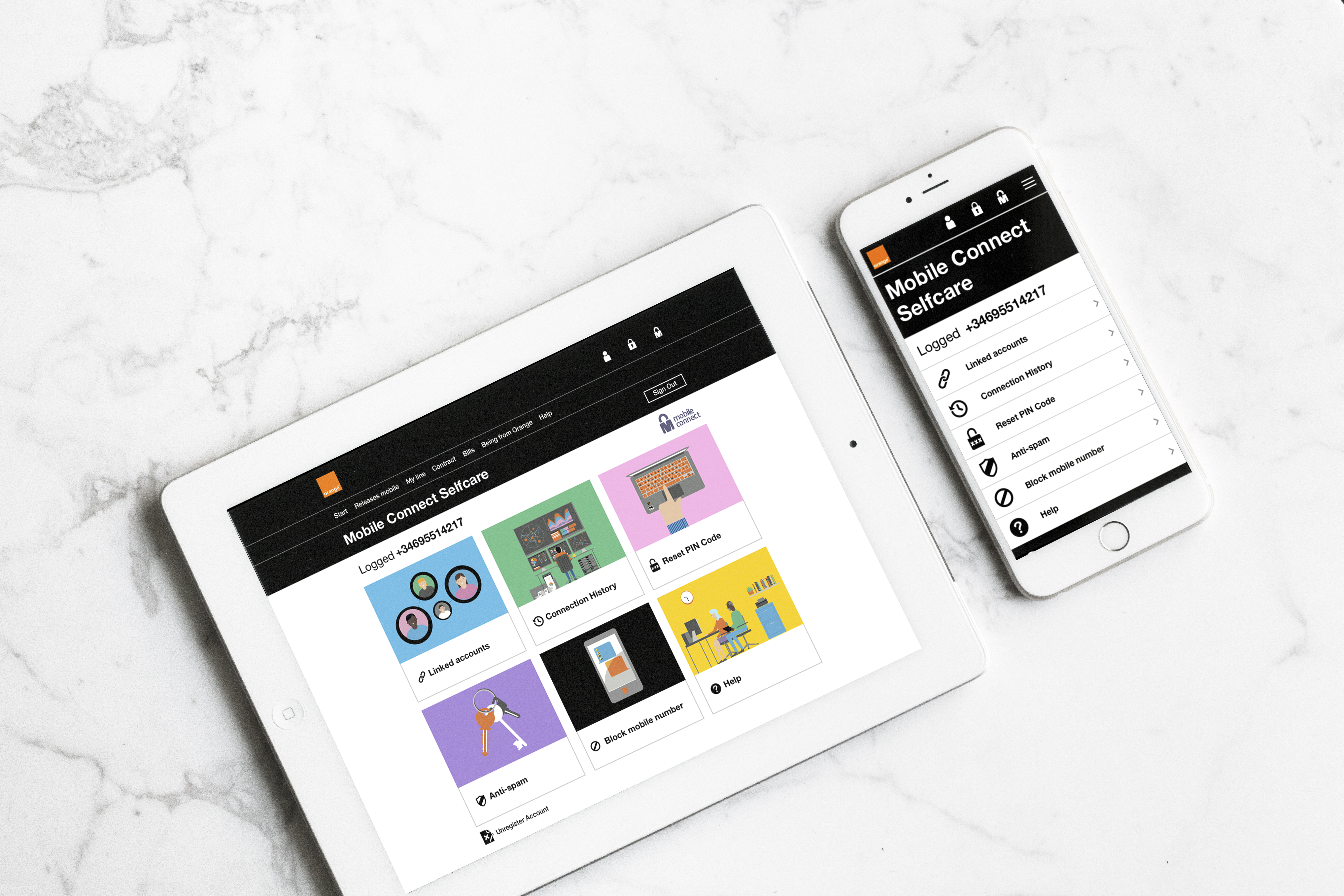
The Desktop version of the design is a responsive website with a 12 grid system. This has been produced using sketch. And going to be build using Bootstrap.
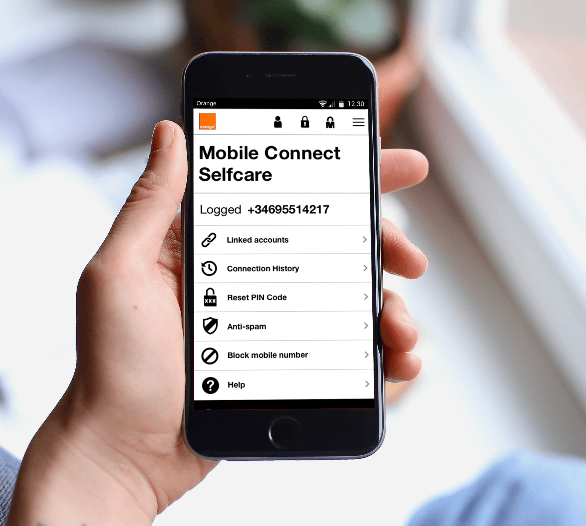
This the mobile version which stems from the desktop responsive design, I have had to change some of the layouts and designs to fit onto a smaller mobile screen. This is also built on a 12 grid system.
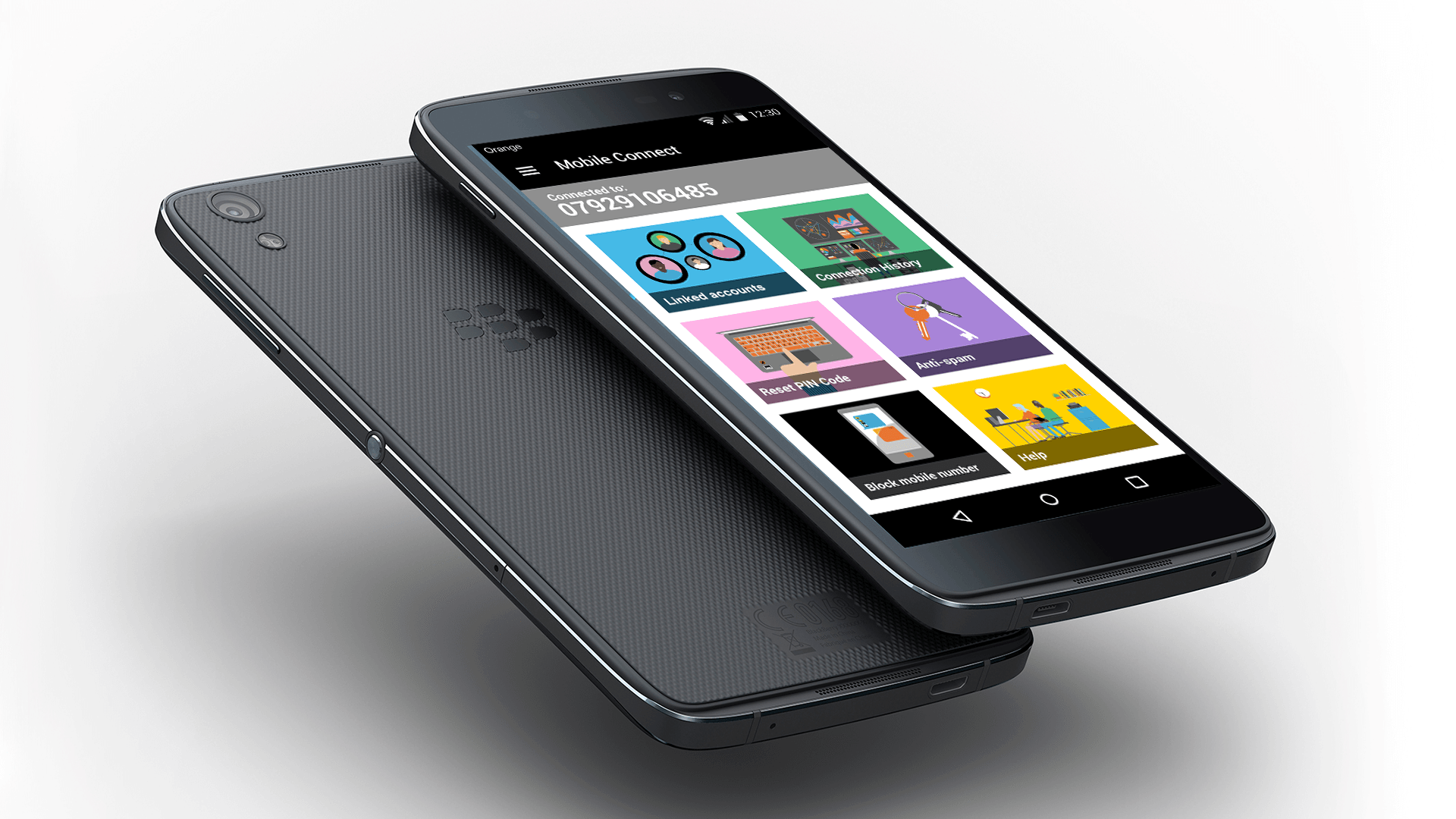
This is the standalone android app created for Mobile Connect. This app has the same abilities as the web version although it has added security with the finger print touch and ease of use being an app.
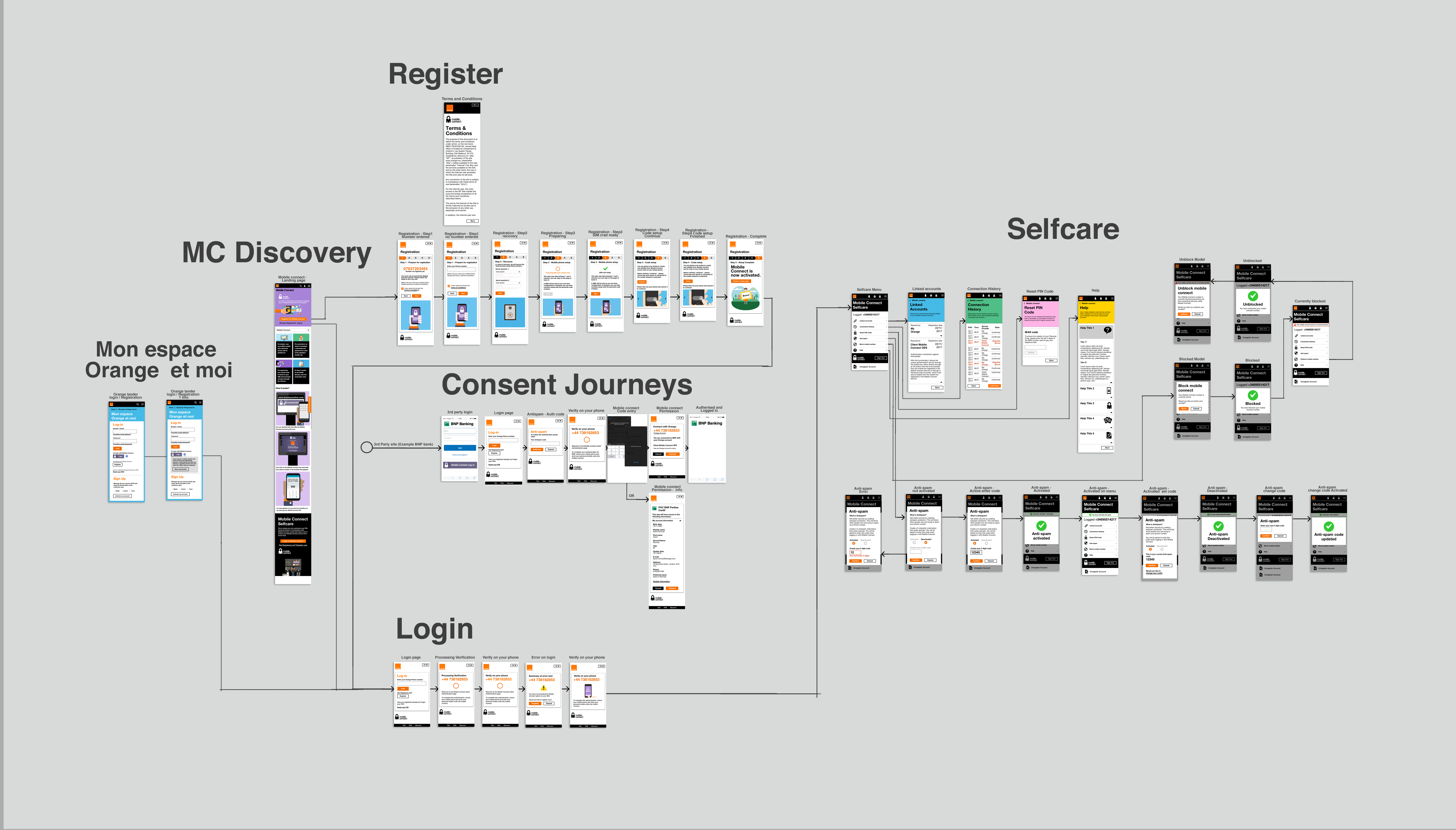
This is a user journey using the mobile version, this was to help the stake holders better understand where the journeys leaded to.
This is the presentation that was presented to the stakeholders using PowerPoint, in which I was directly in charge of creating.
As a result, this project was signed of by the product owners and stakeholders. Which is now in development stage.